Leading with value on Grammarly’s blank state
Tools
Figma, Claude Code
Mentored by
Hiếu Trần, TJ Eby
Overview
I redesigned Grammarly Editor’s blank state to make the first action feel obvious, useful, and connected to the broader product, without interrupting the core Grammarly Proofreader workflow.
“[Jennie] went beyond scope...to large complex problems, such as how Superhuman Docs and Editor should eventually combine. More complex than a normal internship project.”
“[She] consistently shows the ability to think outside the box and redefine problem sets to solve user needs more effectively.”
TJ Eby (Head of Design)
Context
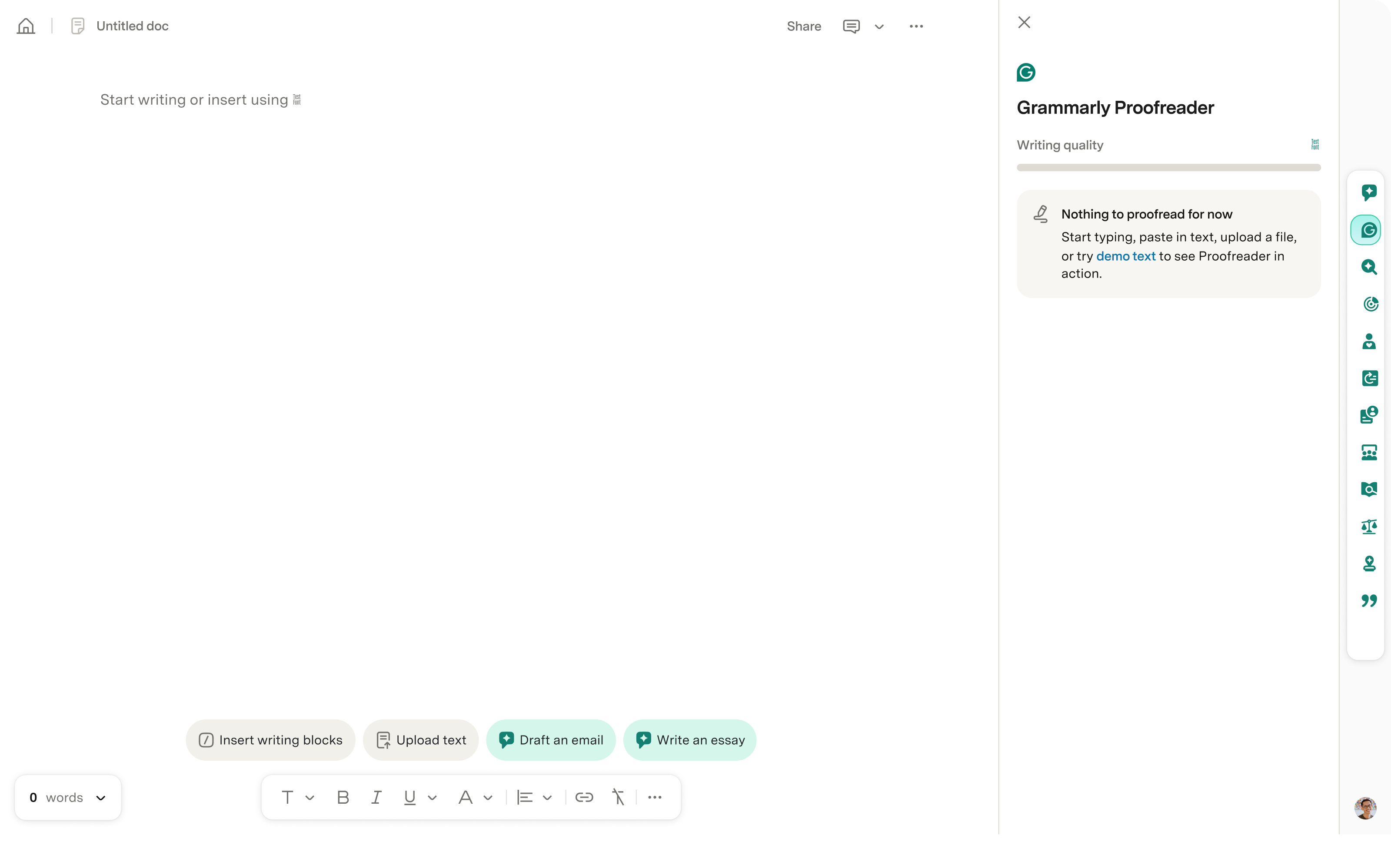
Grammarly Editor has a blank page problem.
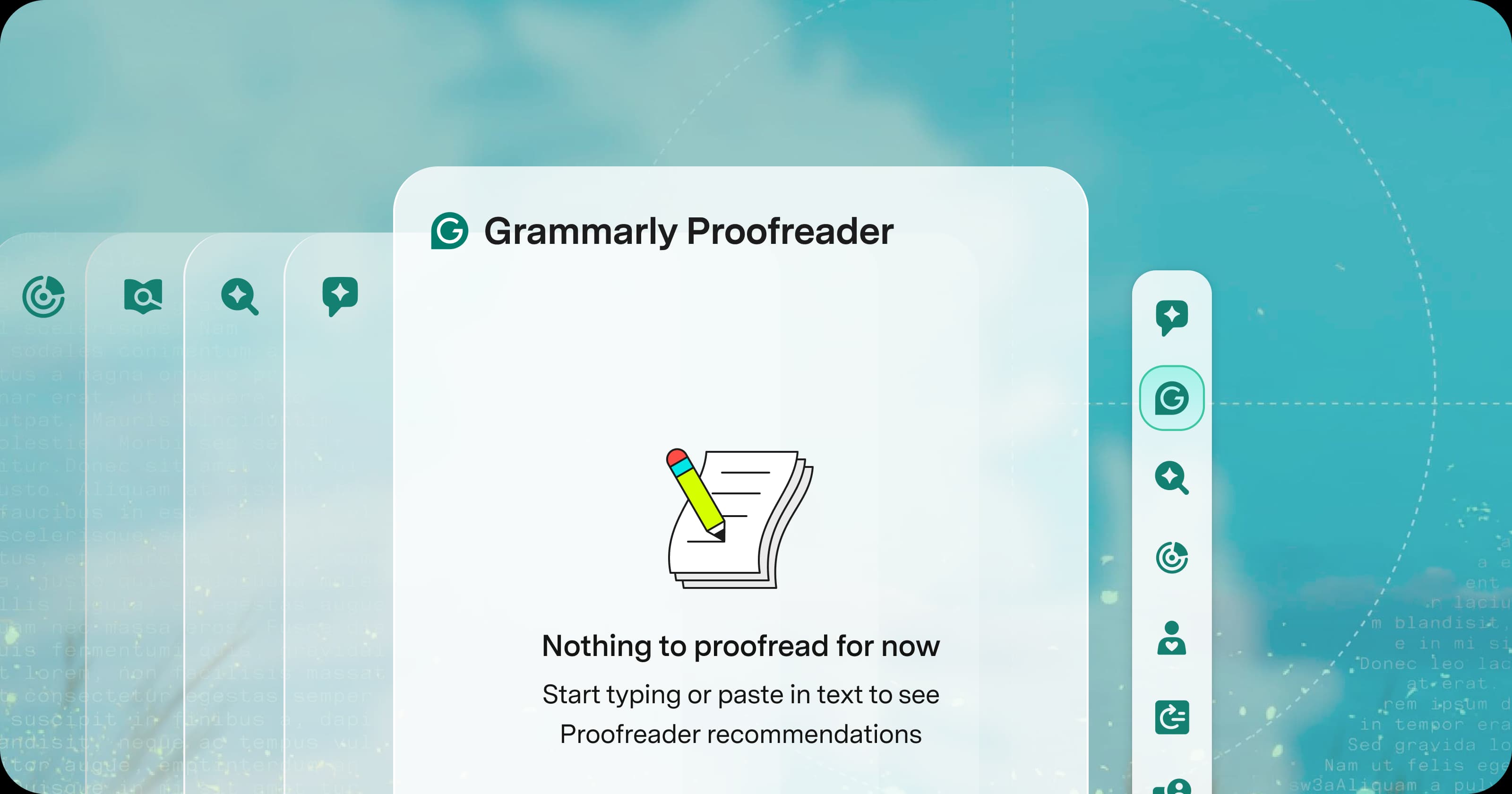
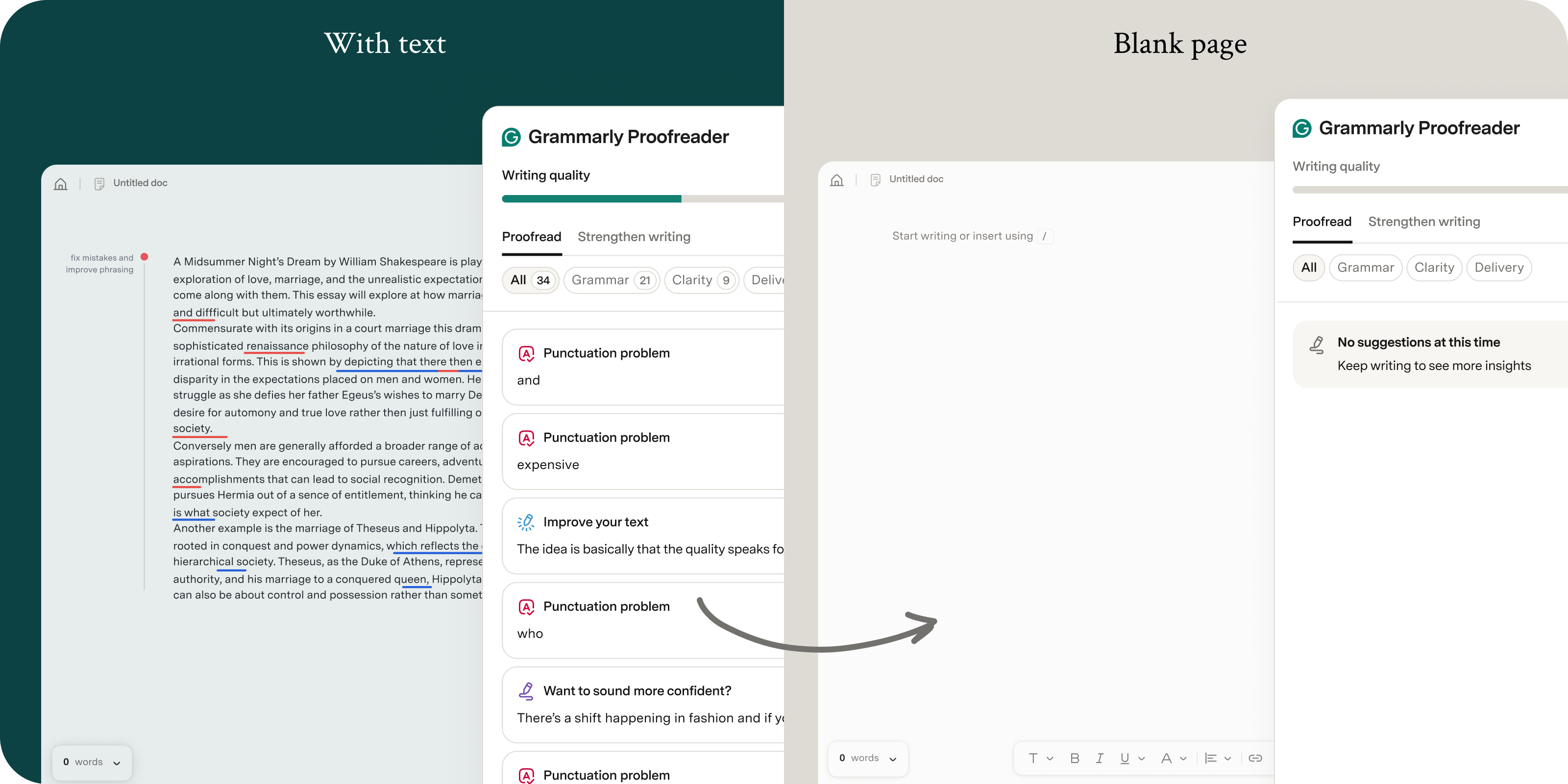
Many people come to Grammarly as a final stop: they paste in finished text, then use Proofreader or the AI Detector for a final review. But people who open the Editor without text get little guidance or immediate value, so there’s no clear reason to start or come back.
Proofreader is useful once there’s text on the page. On a blank page, there’s no clear value or place to start.
The given brief
“Design these four quick starts to help users get text on the page.”
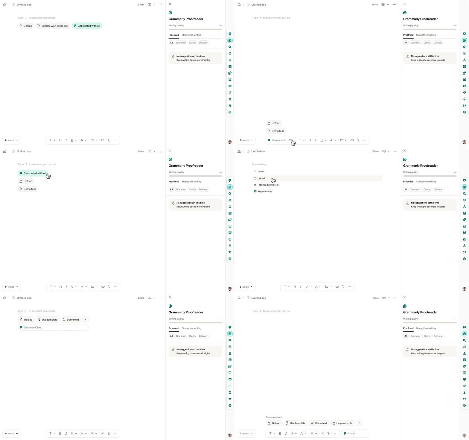
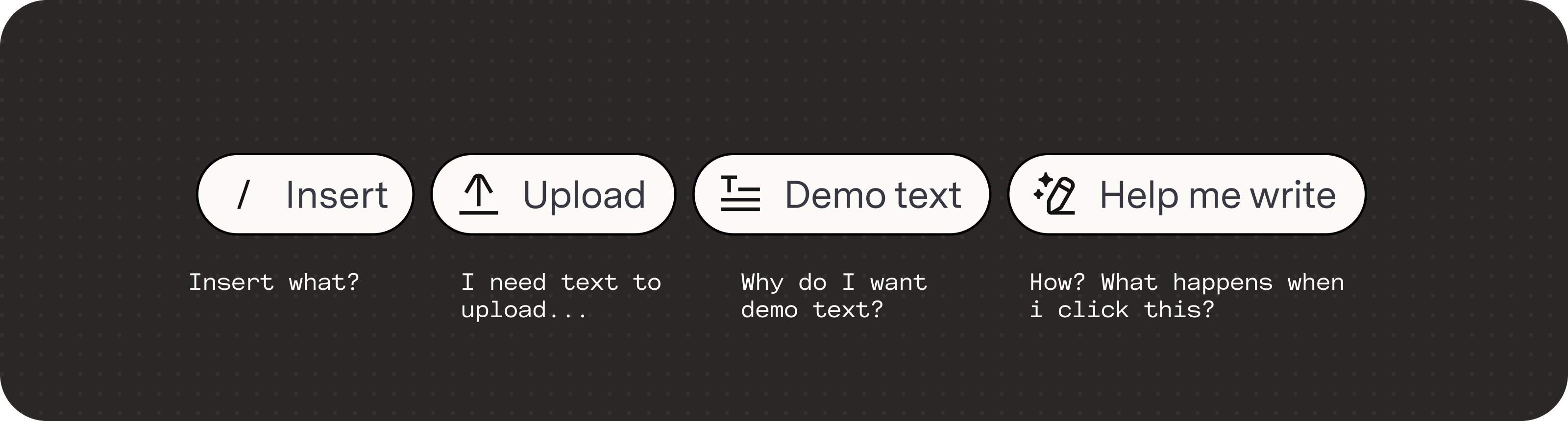
I was given four quick starts and their copy, and asked to figure out how they should appear on the blank canvas. I explored different placements and visual treatments, but the same problem remained: without context, why would someone choose one?
I explored placements for the four quick starts within the main canvas, without using the side panel.
But I kept coming back to the chips themselves:
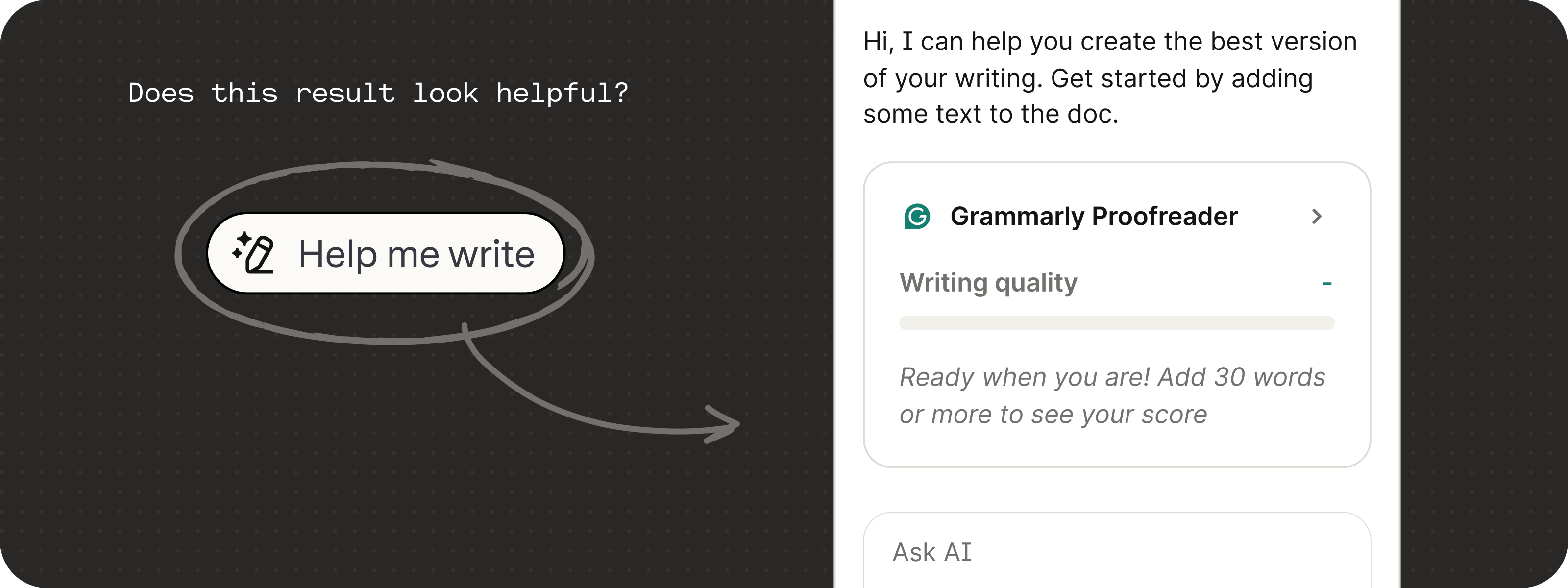
Would anyone actually click one, and would the result feel useful?
Reframing my own brief
Quick starts should feel obvious, low-effort, and clearly helpful to someone who isn’t sure where to begin.
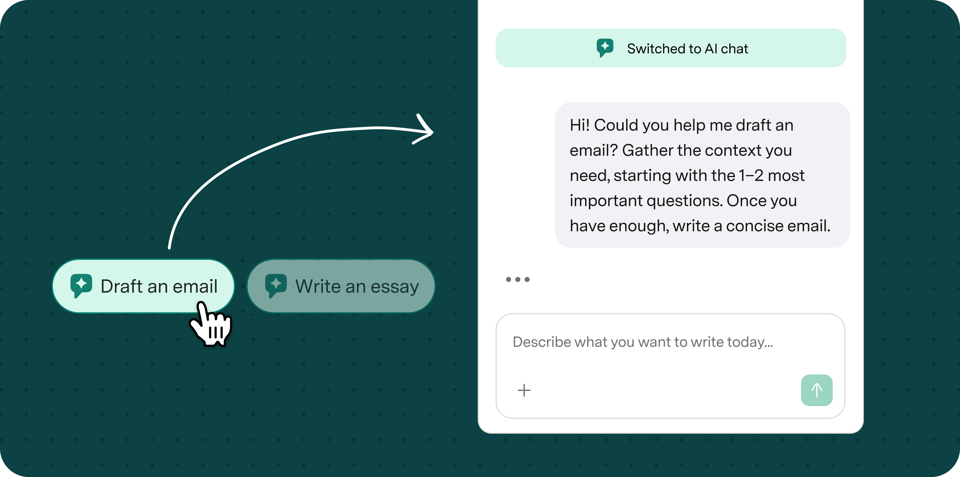
1. Showing what AI Chat can do
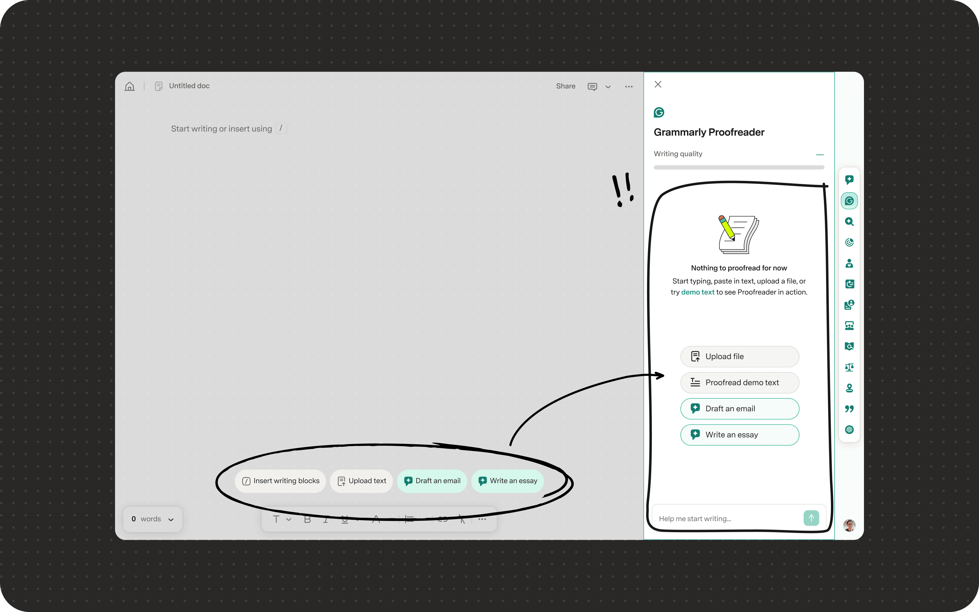
“Help me write” only led to another blank surface. I replaced it with two specific starter prompts that opened AI Chat with an example already in motion, so people could see its value right away.
2. Giving Demo text a clearer purpose
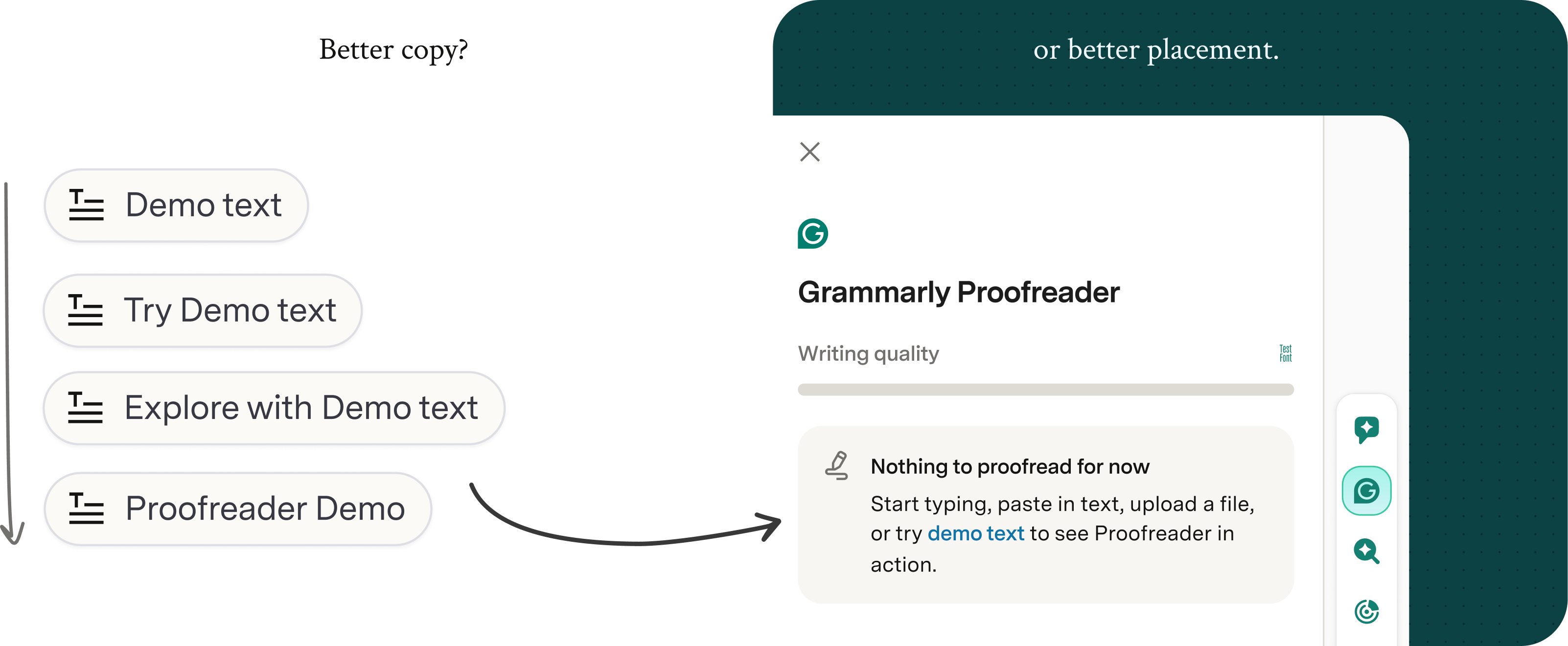
Demo text can show Proofreader in action, but “Demo text” alone isn’t a very motivating CTA. I moved it into the empty Proofreader panel and framed it as a quick way to see Grammarly’s suggestions on a ready-made example.
Shipped experiment
Testing the new blank state with 500K+ Grammarly Editor users.
We compared the existing blank state with the new design in a 21-day experiment. The test was still running when my internship ended, so I don’t have final results to share.
Planning ahead
How should the blank page feel in the long term? And scale with the product?
The experiment had to work around other active tests and a tight engineering timeline. So I expanded my scope and looked beyond to establish a blank-state roadmap that supports the Grammarly Editor and Superhuman Docs merge as one clear and cohesive product experience.
1. “I know where to look.”
To create one clear place to start, I brought the scattered CTAs into the agent panel and explored visual cues that drew attention there.
2. “I see how this could help me.”
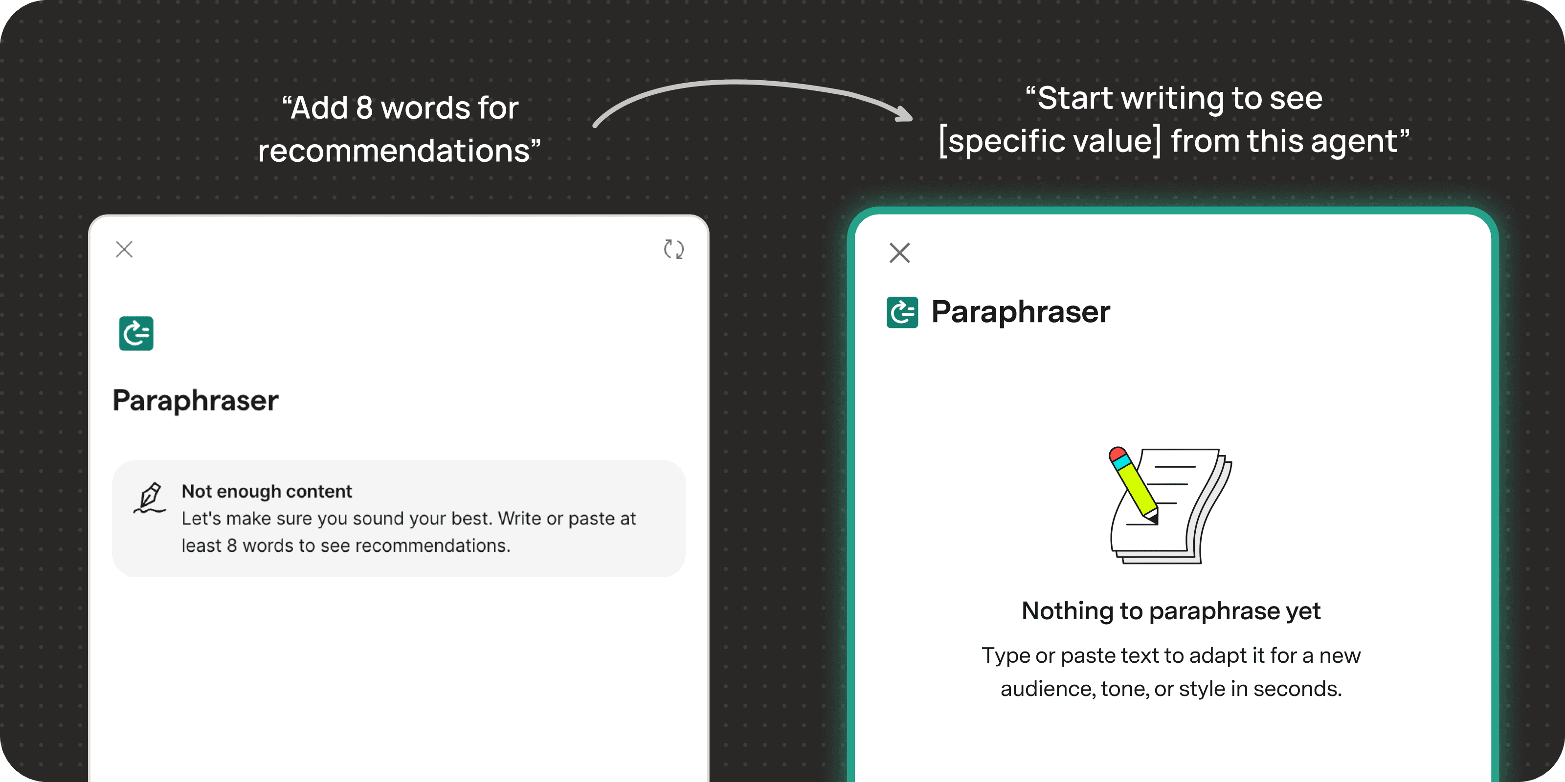
I saw the blank state as an opportunity to explain each agent’s value before users started writing. In partnership with a content designer, I rewrote value-driven blank states for all 12 agents.
3. “This feels like one cohesive experience.”
I extended the blank state design pattern and copy style across every Grammarly agent panel.
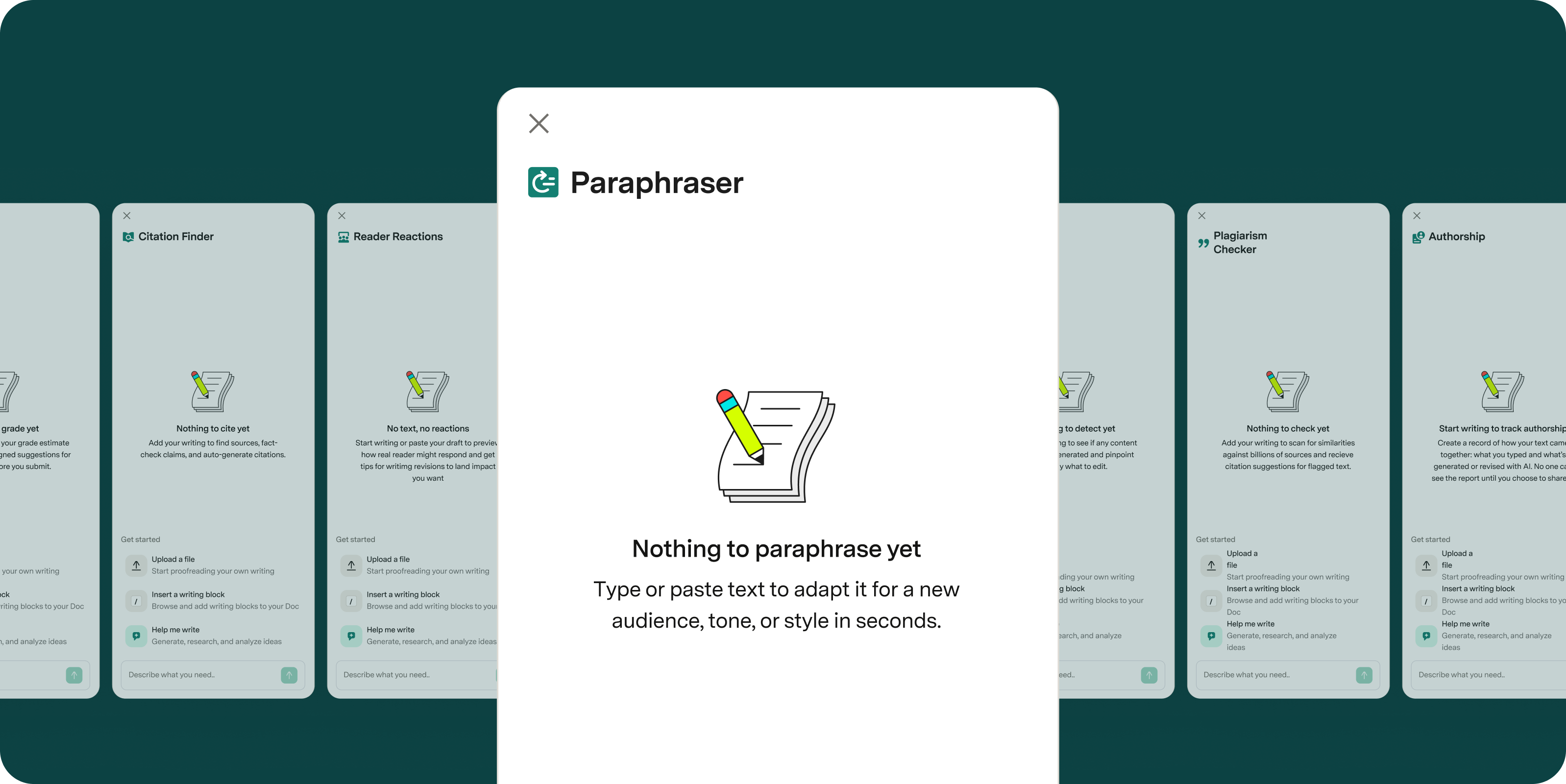
I brought design patterns from Superhuman Docs into Grammarly’s blank state suggestions to support the future product merge.
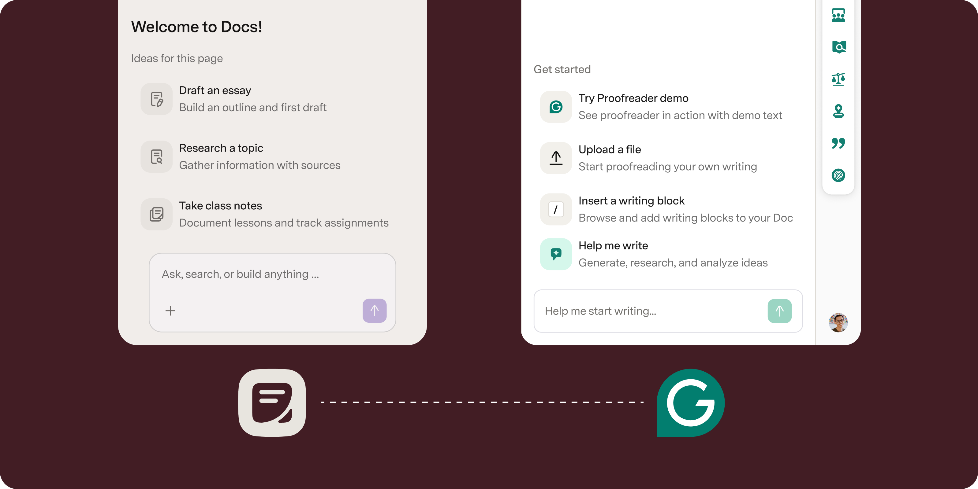
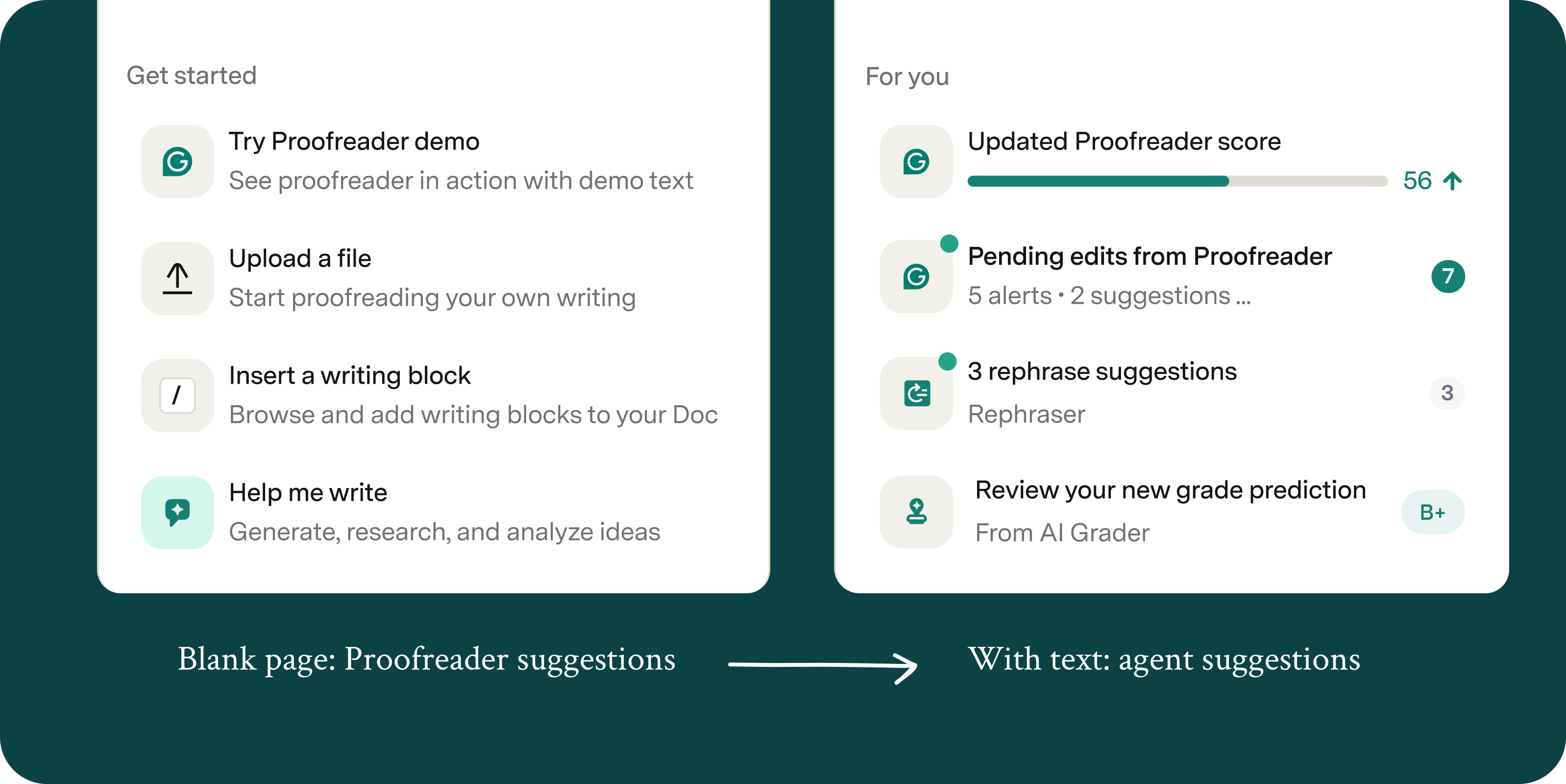
Extending beyond the blank state
I also explored how the starter suggestions could then evolve into proactive agent suggestions after the blank state.